
Zebra Blinds Colours Ideas for Every Room
Zebra blinds are one of the easiest ways to change how a room feels without replacing furniture. Their sheer and solid fabric bands soften daylight, add privacy, and create a clean finish.
Colour matters as much as fabric quality. The right zebra blinds colour can make a condo feel brighter, help a bedroom feel calmer, or give a home office a sharper look. Since zebra blinds sit directly in the sightline, they should work with your walls, flooring, furniture, and light.
Related Article: How to Choose the Right Colour When Buying Blinds
Why Zebra Blind Colours Matter
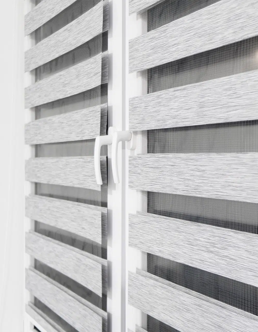
Zebra blinds combine the softness of fabric shades with the control of horizontal blinds. That makes colour choice more visible than on a simple roller shade. The shade colour affects how much light enters the room, how private the space feels, and how finished the window looks.
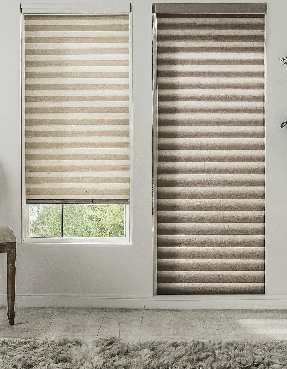
Light colours reflect more daylight and help small rooms feel open. Medium neutrals add warmth without overwhelming the room. Darker colours create stronger contrast, which works well in spaces with larger windows, simple walls, and bolder furniture.
Before choosing a colour, look at three details:
- Wall colour and trim colour
- Flooring, rugs, and major furniture pieces
- How much sunlight the room receives
A showroom colour that looks soft can appear brighter in a south-facing Toronto condo. A darker fabric can look elegant in the evening but may feel heavy in a small room during the day.
Related Article: Why Zebra Blinds Are Perfect for Toronto Homes: Style Meets Function
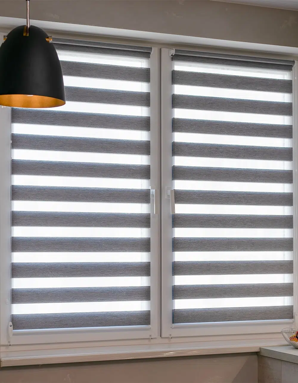
Living Room Zebra Blind Colours
The living room usually needs balance. It should feel comfortable enough for everyday use and polished enough for guests. Zebra blinds in this room should support the design instead of becoming the only feature.
Good living room colour options include:
- Soft white for a fresh, bright look
- Warm ivory for beige, cream, or oak tones
- Light grey for modern condos and cool-toned interiors
- Taupe for warmth with a grounded feel
- Charcoal for strong contrast in larger rooms
White and ivory zebra blinds work well when the goal is to maximize daylight. They keep the room open and help furniture, artwork, and flooring stand out. Light grey is a practical choice for Toronto homes with black window frames, grey sofas, or cooler paint colours.
Taupe is ideal when pure white feels too sharp. It pairs well with natural wood, woven textures, leather, and warm metal finishes. Charcoal can look striking in a larger living room with white walls and minimal décor.
Bedroom Zebra Blind Colours
Bedrooms need a quieter colour direction. The best zebra blind colours for bedrooms usually sit in the soft neutral range because they help create a more restful feel.
Consider these bedroom shades:
- Cream for a soft and warm finish
- Beige for classic comfort
- Greige for a modern neutral look
- Soft grey for a calm, clean style
- Deep grey for a more dramatic bedroom
Cream and beige zebra blinds are useful in bedrooms with warm flooring, wood furniture, or off-white walls. They soften the room and avoid the stark look that bright white can create.
Greige is a strong choice because it sits between grey and beige. It works with both warm and cool elements, so it is easier to match if your room has mixed finishes. Soft grey suits bedrooms with white bedding, silver accents, or a more minimal design.
For better sleep, colour should be considered with fabric opacity. Zebra blinds can help manage privacy and filtered light, but room-darkening or blackout options may be better for bedrooms facing streetlights, neighbouring buildings, or early morning sun.

Kitchen Zebra Blind Colours
Kitchen blinds need to look clean, bright, and easy to maintain. Since kitchens often have hard surfaces, appliances, tile, and cabinetry, the blind colour should keep the window area simple.
Popular kitchen zebra blind colours include:
- Crisp white for a clean kitchen look
- Soft grey for stainless steel appliances
- Ivory for warm cabinets and brass finishes
- Sand for natural wood or cream cabinetry
White zebra blinds remain a favourite for kitchens because they make the space feel fresh. They are effective in smaller kitchens or condo layouts where the kitchen shares sightlines with the dining or living area.
Soft grey works well with stainless steel appliances, quartz counters, and grey-veined stone. Ivory and sand suit kitchens with warm white cabinets, butcher block counters, beige tile, or gold-toned hardware.
Avoid choosing a colour based only on the cabinet doors. Look at the backsplash, counter, flooring, and nearby walls. A colour that connects two or three finishes will look more intentional.
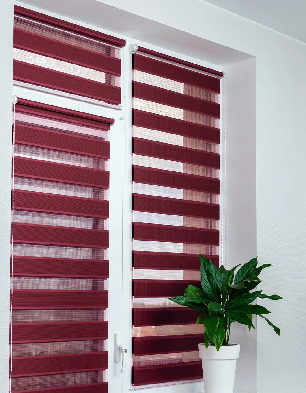
Dining Room Zebra Blind Colours
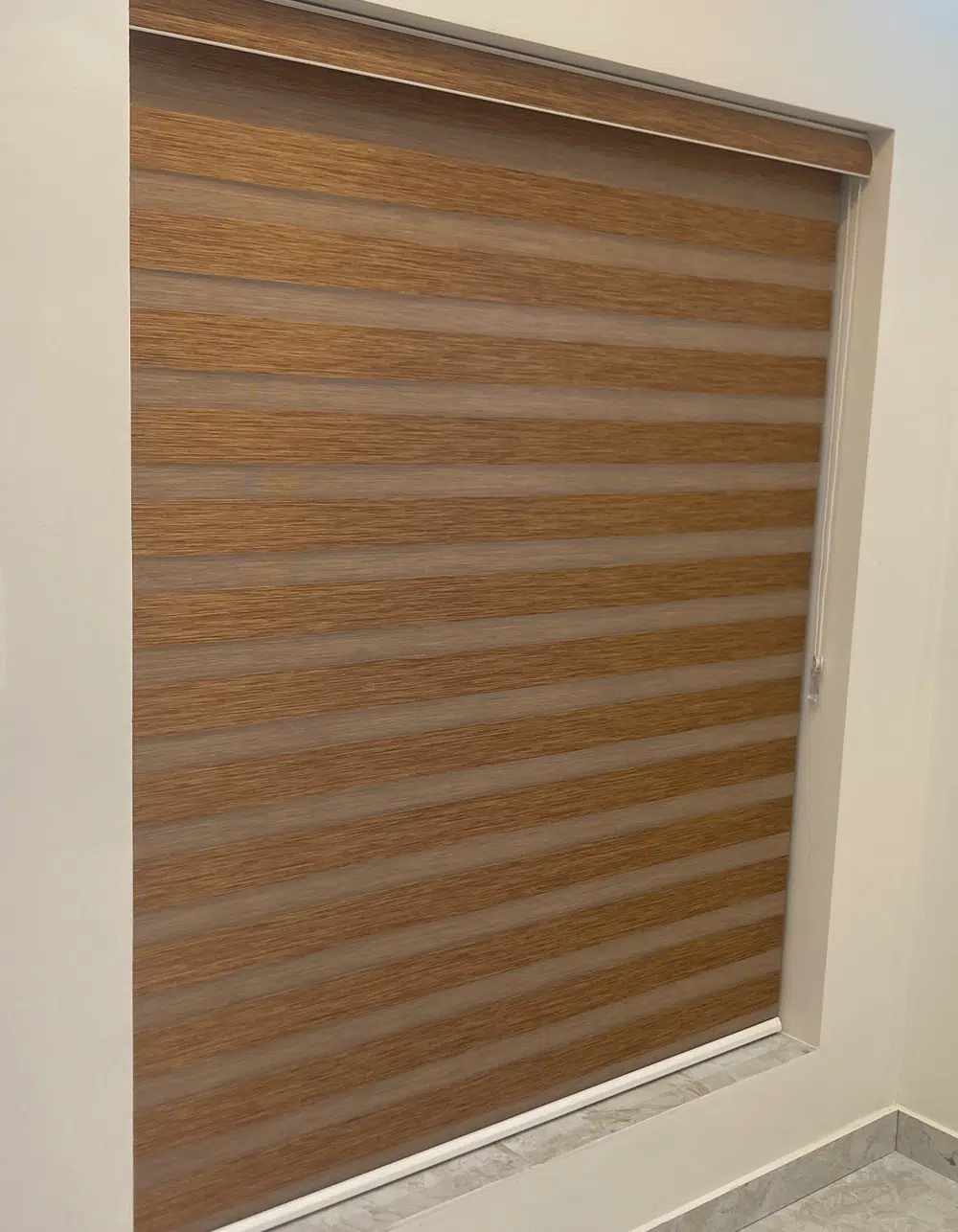
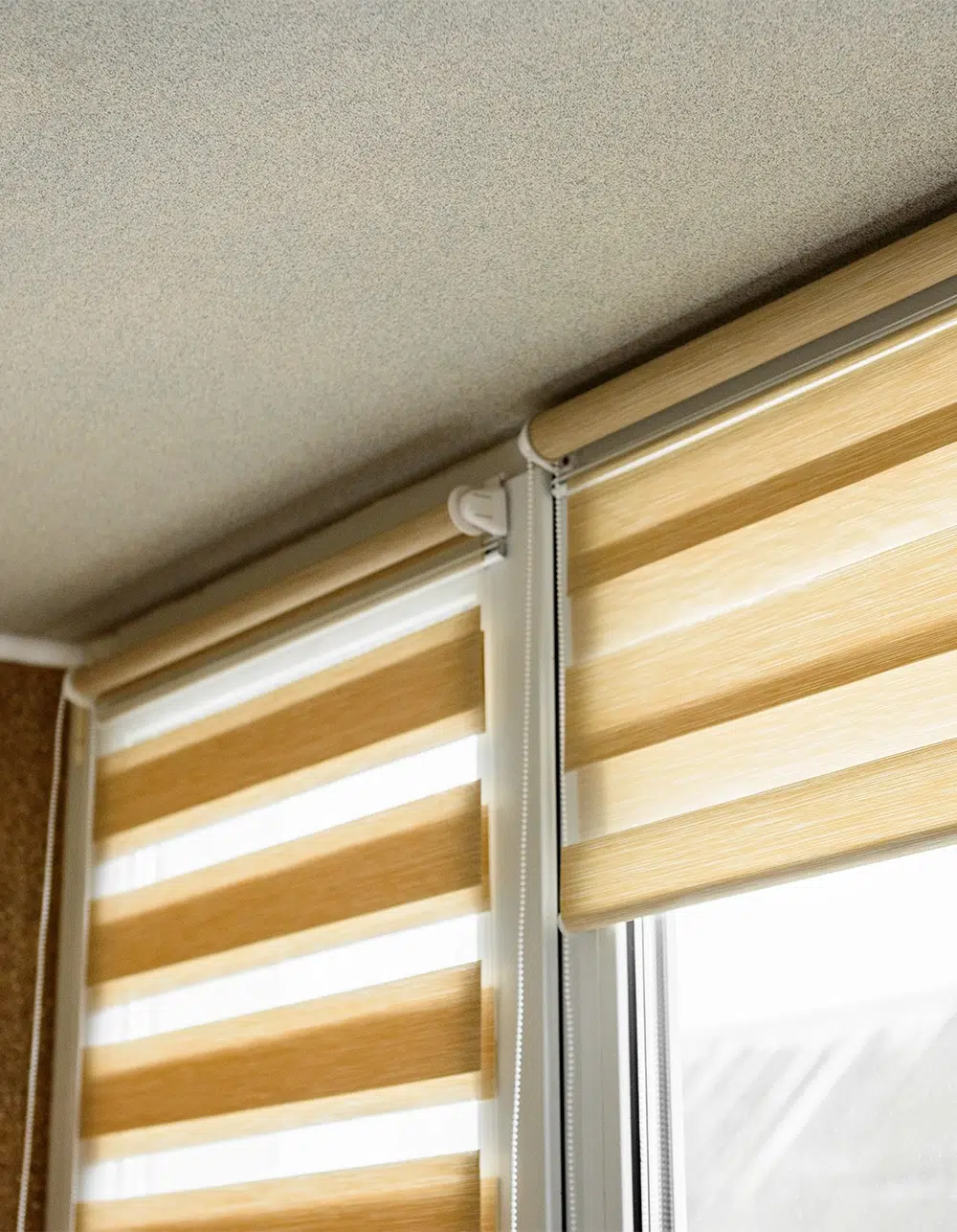
The dining room can handle slightly richer colour choices than the kitchen. For a softer room, choose ivory, beige, or warm grey. For a more formal space, consider charcoal, espresso, or deeper taupe.
Dark shades can frame the windows and add contrast, especially if the walls are light. If your dining room connects to the living room, stay close to the same colour family so the view feels consistent.
Home Office Zebra Blind Colours
A home office needs glare control, comfort, and a clean background for video calls. The best zebra blinds colour depends on screen glare and how you want the room to feel during work hours.
Strong choices include light grey, warm white, greige, and charcoal. Light grey looks professional and reduces harsh contrast. Warm white keeps the space bright without feeling clinical. Greige is helpful if the office has wood furniture or warmer paint colours.
Charcoal can work well in a sunny office because it reduces glare visually and adds a focused mood. It is best used with lighter walls, good task lighting, and a room that receives strong daylight.
Related Article: Do Zebra Blinds Improve Energy Efficiency?

Bathroom Zebra Blind Colours
Bathroom window coverings need privacy first. Choose white, ivory, light grey, sand, or soft taupe based on the tile, vanity, and hardware. White feels clean, light grey suits modern finishes, and sand adds warmth to beige tile or wood vanities.
Matching Zebra Blinds Across the Home
You do not need the same zebra blinds colour in every room. Still, there should be a clear connection from one space to another, especially in open-concept homes.
A simple approach is to choose one main neutral for shared spaces and adjust slightly for private rooms. For example, use soft grey in the living room and home office, then choose greige or cream in the bedrooms.
Keep these pairing rules in mind:
- Match undertones rather than exact colours.
- Use lighter shades in small or dark rooms.
- Use darker shades when the room has enough natural light.
- Keep open-concept areas within the same colour family.
- Test samples during morning, afternoon, and evening light.
Related Article: Zebra Blinds Buying Guide: What to Look For

Get the Colour Right Before You Order
Zebra blinds should look good in daylight, evening light, and artificial lighting. A colour that works at noon may read differently at night, especially with warm bulbs or cool LED lights.
Our team can help you compare samples against your walls, trim, flooring, and furniture before you commit. With custom zebra blinds, accurate measurements, and professional installation, the final result feels clean, practical, and made for the room.
If you want zebra blinds that suit each room instead of guessing from a small online image, book a free in-home consultation with Blinds Toronto today.
Frequently Asked Questions
What colour zebra blinds are best for most rooms?
Neutral colours are usually the safest choice for zebra blinds. White, ivory, beige, greige, and light grey work with most interiors, reflect daylight well, and give the room a clean finish without competing with furniture, flooring, or wall colours nearby.
Can I use different zebra blinds colours in each room?
Yes, you can use different zebra blinds colours in each room. Keep undertones consistent so the home still feels connected. For example, use light grey in shared spaces, then choose cream, greige, or taupe in private bedrooms upstairs too. nicely.
Do light zebra blinds make a room look bigger?
Light zebra blinds usually make a room look bigger because they reflect more daylight and reduce heavy contrast around the window. White, ivory, and pale grey are strong choices for smaller rooms, condos, and spaces with limited natural light overall.
When should I choose dark zebra blinds?
Choose a darker colour when the room has strong natural light, pale walls, and enough space to handle contrast. Charcoal, espresso, and deep grey can look elegant in living rooms, dining rooms, and offices with simple modern furniture pieces today.
What colour zebra blinds work best in kitchens?
Kitchen zebra blinds usually look best in white, ivory, soft grey, or sand. These colours pair well with tile, cabinets, appliances, and counters. They also keep the window area fresh, bright, and easy to match with existing décor tones today.